

I have a side project whose entire purpose is to make letters look like a teenager went at them with a spray can. You type a word, it fattens into one connected outline, then a stack of warps shoves it around until it reads as graffiti. It is a deeply unserious project. So naturally I spent a weekend building a forensic area-diff tool to referee it, because that is apparently who I am.
Here’s how the unseriousness turned serious. One step in the pipeline is a polygon offset — grow a closed shape outward by N pixels to draw the outline. Textbook geometry, and JavaScript has at least three grown-up libraries that do it. The sensible move is to pick the one with the nicest README and never think about it again.
I thought about it. Turns out two of the three produce byte-for-byte identical geometry, the third quietly fibs, and you cannot see any of that with your eyes. Which is the whole point.
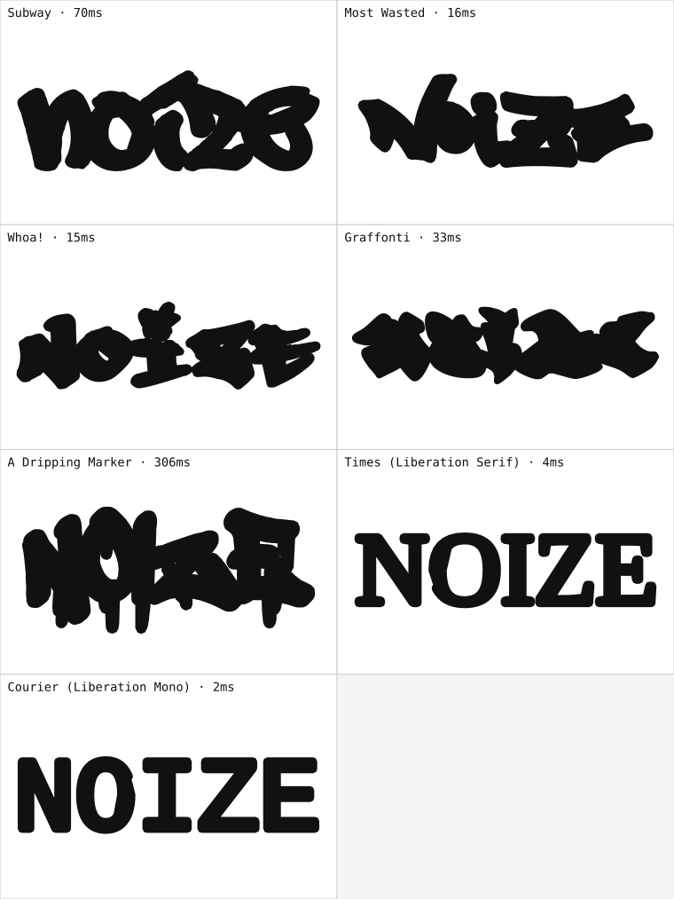
The project in question. Deeply unserious. Note the two boring faces on the bottom — a plain serif and a monospace — because they end up mattering far more than they look.
TL;DR: Three JavaScript polygon-offset libraries, tested with a symmetric-difference-area diff instead of eyeballing the shapes. Two turned out to be geometrically identical (0.000% apart) and just a speed pick between them. The third — the popular, ergonomic one — quietly drifted up to 10% on delicate serif shapes, while also being 10–30× slower. The numbers:
| Engine | vs. reference (XOR area) | speed |
|---|---|---|
| JS port of the reference | 0.000% | 1× (reference) |
| WASM build of the same | 0.000% | 2–4× faster |
| The charming third one | 0.4–2.8% (display) · up to 10% (serif) | 10–30× slower |
Why Can’t You Just Eyeball Two Outlines?
Geometry is where visual inspection goes to embarrass itself. Two offset outlines of the same word can look pixel-identical in the browser and differ by thousands of points under the hood. Or look identical and be off by a third of a unit — nothing, a rounding shrug — that then compounds through a boolean union into a genuinely wrong shape. Show me two outlines side by side and I will confidently tell you they match. I will be wrong, and I will be sure.
A screenshot diff would have blessed all three libraries. A point count would have told me they were different without telling me whether the difference was a problem or a personality. Neither is the question I actually had.
For filled shapes the honest metric is area — specifically the symmetric difference. Lay outline A over outline B, keep the bits that belong to exactly one of them (an XOR), and measure that leftover area as a percentage of the reference. Two engines that truly agree score zero. One that drifts tells you how far, in a number that means something.
So instead of choosing a library, I built a tiny courtroom. Same word, same font, same offset distance, run through each engine, then diff against Clipper as the reference:
areaXOR(a, b) / areaFill(a) * 100 // 0% = geometrically identical
Which Libraries Turned Out to Be Identical?
First verdict, and it’s the comforting one: two of the three "different" libraries scored 0.000% against each other. Every font. No daylight between them at all.
Which is not luck — it’s a fact I could only know because I checked. One is a pure-JavaScript port of a famous C++ geometry library; the other is that same C++ hauled into WebAssembly. Same DNA, two upbringings. You’d hope the port is faithful, but "hope" is not a test, and reimplementations drift for a living — an off-by-one in a fill rule, a rounding mode nobody documented, an edge case the port author simply never hit. A flat 0.000% XOR area across a pile of wildly different letterforms is what "faithful" looks like when you make it say a number out loud.
And once you know they’re twins, the choice stops being about right-and-wrong and becomes a drag race. The WASM build ran 2–4× faster for identical output. Done: fast twin in the hot path, readable JavaScript twin kept around as the reference and for headless scripts. Easy call — but only easy because the geometry question got answered first, instead of being assumed away.
Which Library Quietly Drifted?
The third library is the popular, ergonomic one. Gorgeous API, wonderful at boolean ops, firm handshake, remembers your name. Against the reference it scored 0.4% to 2.8% on the graffiti display fonts. Small enough to wave off — "close enough, ship it" — especially since, again, the shapes looked fine.
Then I added the narcs.
I dropped two boring reference faces into the test set — a plain serif and a monospace, the typographic equivalent of a hall monitor — right next to the loud graffiti fonts. The drift on those didn’t stay small. It jumped to around 6% on the monospace and 10% on the serif.
That jump is the actual lesson wearing a disguise. The library drifted worst exactly where the geometry was most delicate — thin serifs, hairline stems, tight little counters — which is, of course, precisely the case you can least afford to get wrong. On a fat spray-paint letter a 10% error has nowhere to hide and nothing to ruin. On a hairline serif it has the run of the place. If I’d only tested the "real" inputs — the display fonts the project is actually about — the 10% case would never have shown up, and I’d have happily shipped a subtly broken outline on the exact shapes that expose it. The most boring font in the drawer was the most useful witness in the room.
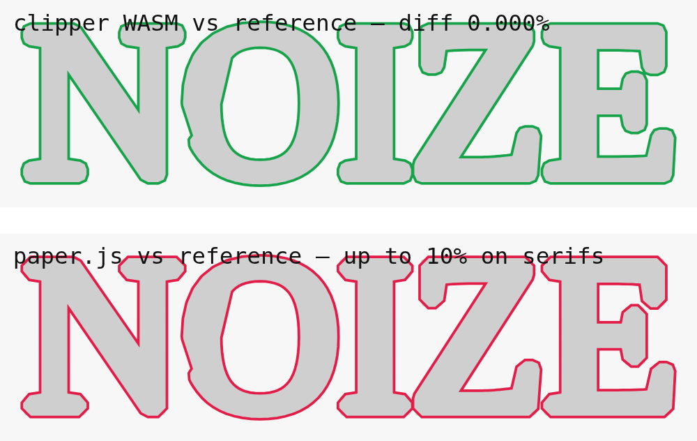
Grey is the reference offset. Top: the WASM engine (green) traces it exactly — 0.000%. Bottom: paper.js (red) floats a hair outside the true edge, everywhere at once. That gap is the drift — and notice you only spot it because someone drew both lines on the same shape. Left to their own panels, all three outlines look completely fine.
It was also 10–30× slower than the WASM engine, so it managed to be both wrong and last. The slowness I’d have caught on my own eventually, the way you notice a room’s gotten cold. The geometric drift I would not have — not without pointing a diff at the right quantity.
Why Was the Measurement Tool Itself the Bottleneck?
One more finding, filed under quietly-embarrassing. To score "quality" I’d written a metric that counts self-intersections in an outline — the classic smell of a warp gone feral. First implementation was the obvious one: every edge against every other edge, O(n²). Correct. Honest. Fine.
It was also, once the comparison grid grew to a hundred-plus renderings each carrying thousands of points, the single slowest thing in the whole project — slower than all the actual geometry it was hired to evaluate. I had built a courtroom and the bailiff weighed more than the defendant. The fix was to stop hand-rolling it and let the geometry library resolve self-intersections with a sweep-line (SimplifyPolygon, O(n log n)) and compare the result. Same signal, a whole complexity class lighter.
Say it plainly, because it’s easy to forget: the tooling you build to measure a thing is also code, and it is fully capable of being the bottleneck. A benchmark harness slower than what it benchmarks. A linter slower than the compile. A quality metric slower than the render. All the same joke, and it’s usually on you.
What’s the Generalizable Lesson Here?
- "Drop-in replacement" is a claim about the API, not the output. For anything numeric or geometric, prove it with a diff before you trust it. Two libraries agreeing on function signatures tells you nothing about whether they agree on answers.
- Pick a diff that speaks the domain. For filled outlines that’s symmetric-difference area — not a point count, and for the love of god not a screenshot. The right metric turns "looks the same" into "0.000%" or "10%, exactly where it hurts."
- Test the inputs most likely to break, not the flattering ones. The dull serif I almost didn’t bother adding is the one that ratted out the drift. Boring, delicate, and adversarial cases carry more information than the happy path — invite them.
- Settle correctness as a number and the rest of the decision falls out. Two engines proven identical collapse to a pure speed pick; one that’s slower and wrong disqualifies itself. A good measurement doesn’t just inform the argument, it ends it.
- Watch the harness, not just the subject. Your quality metric can be asymptotically worse than the thing it’s judging. Weigh the bailiff.
The whole rig — diff harness, warp pipeline, and the graffiti it was all secretly in service of — is open source if you’d like to poke at it: github.com/jhalitschke/warp-lab.